This is a response to ‘The Spirit Level’ and the response to it, with discussion of the implications to be drawn for tackling inequality. You can also download it as a pdf (67kb).
This article is on 5 pages, and you can go to the next page you want by clicking on the relevant number at the bottom of each page.
Introduction – Selling Equality to the Rich
‘The Spirit Level’ is a book-length distillation of the work of Richard Wilkinson and Kate Pickett on the statistical relationship between standard measures of economic inequality and various social ills, such as ill-health, lack of social trust and crime. Its importance, and the controversy surrounding it, derives from its apparent ‘scientific’ justification of what might otherwise be instinctive or ‘moral’ beliefs in the desirability of equality.
The significance of the work is in the prospect it raises of a new dimension to the clash between rich and poor – clear-cut evidence showing that social factors affecting the whole population (rich and poor alike) are beneficially affected by a smaller spread between the highest and lowest incomes. These benefits come over and above the individual advantage of a higher rather than lower income.
While not necessarily disputing their conclusion, in this essay I point out the potential weaknesses that cast doubt on their particular analysis, and so render it a less than potent political weapon for egalitarians. At the same time I emphasise the importance of tackling overall inequality, not just inequality of income and wealth, for the benefit of the vast majority who would certainly gain.
Inequality as ‘Social Pollution’
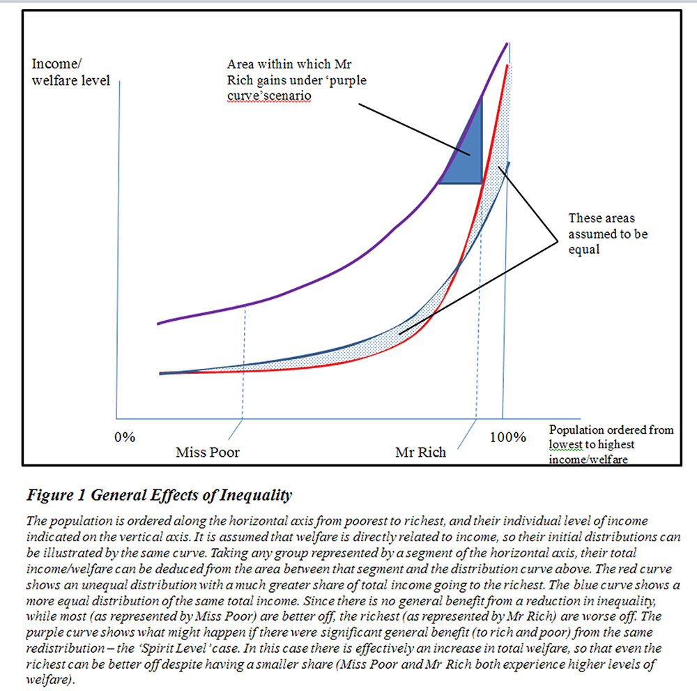
From the point of view of those with high incomes, if greater equality improves their absolute welfare no intrinsic social conscience is necessary to see this as desirable. This clearly broadens the potential appeal of egalitarian policies that involve the redistribution of incomes and wealth. We can illustrate the argument diagrammatically.

Figure 1 above shows the share of incomes (and assuming a direct relationship between the level of income and welfare, the latter also) plotted on the vertical axis, against the population ordered from lowest to highest income on the horizontal axis. The red curve shows the income level rising slowly from person to person for those with lower incomes, then much more rapidly for those with higher incomes. The total income is given by the area under the curve, and the total income received by any group is indicated by the area under the part of the curve on which that group is situated. Under the red curve the area belonging to the poorer half of the population (on the left of the graph) is much less than that belonging to the richer half (on the right of the graph). This red curve therefore represents a high level of inequality of income, and consequently of welfare.
The blue curve on the diagram represents a more equal distribution of the same total income. Assuming no direct effect of the reduction of equality, the welfare levels would also be distributed according to the blue curve. While the majority of the population are therefore better off with the blue curve – since their welfare levels lie above what they would have been with the red curve – there are a small number of the rich who are now worse off. This is likely to be a block to motivating political support for inequality reduction, firstly because the economic power of the rich can be translated into political power in disproportion to their numbers, and secondly perhaps because of aspirational beliefs of some of those who would currently be better off but calculate according to a positive probability of one day being among the rich. The extent to which these beliefs are fostered by organisations and media outlets controlled by the rich serves their current interest in maintaining the red curve.