If however, as Wilkinson and Pickett argue, a lowering of inequality is associated with a general benefit throughout society, in the sense of reducing some sort of ‘social pollution’, then an income redistribution from rich to poor may result in a welfare distribution following not the blue curve, but the purple curve on the diagram. In this case everyone rich and poor is to some extent better off. Redistribution of income has improved everyone’s welfare, because it has also increased the total quantity of welfare to be shared out. The self-interested rich should rationally support this redistribution to the extent that the net result of the redistribution and the overall gain leaves them better off. While they may have a smaller percentage of the total welfare than before, they can be better off because they have a smaller percentage of a larger total.
If we take the case of Miss Poor on our diagram, under a shift from the red curve to the blue curve – redistribution but with no general effect of inequality – she gains from getting an enhanced share of unchanged total welfare. She will gain even more if there is a general effect of decreased inequality so that her post-distribution welfare level is determined by the purple curve. By contrast, under redistribution Mr Rich loses from a shift from the red curve to the blue curve, since he is getting a lower share of the same welfare total. He will gain, however, from a shift to the purple curve as long as his movement down the slope of the purple curve (from his reduced share of the total) is offset by the higher level of the purple curve. This gain results for him as long as his post-redistribution position on the diagram remains within the marked blue triangle.
Why ‘The Spirit Level’ is not a Clincher
Individual Income and Individual Welfare
If Wilkinson and Pickett’s interpretation of the data, as demonstrating a generalised effect of inequality that impacts on rich and poor alike, is correct this is an important finding. However it is a subtle one to understand, and its clinching of political arguments for greater equality is not given. For example, those at the top of the income curve may turn out to value their relative position more highly than expected. This may imply a translation from high incomes to high welfare great enough to offset the general effect from any feasible redistribution – at least for the wealthiest (and most powerful).
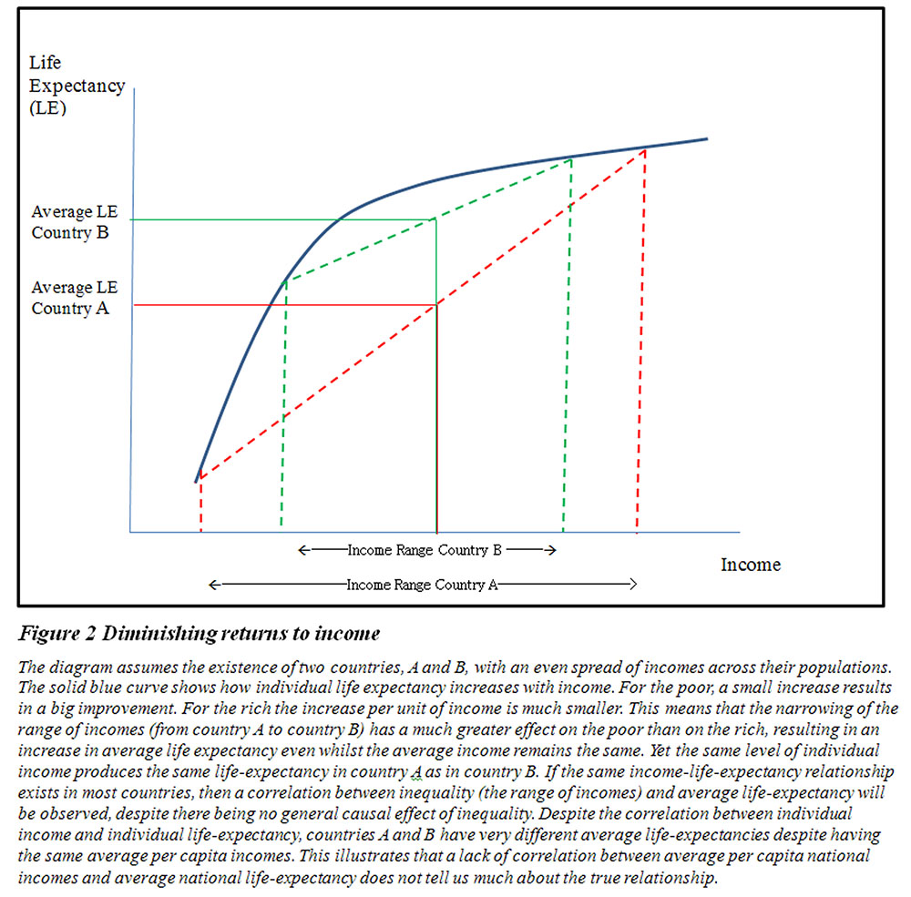
Moreover, their statistical findings are open to doubt from two important sources. Firstly, there is a statistical peculiarity with much of the effects they elicit. It is not enough to show a correlation between inequality and, say, average life-expectancy across countries and regions. At the least, other plausible explanations for this correlation must be ruled out. One plausible explanation lies in the nature of the relationship between individual income and individual life-expectancy, before the general impact of inequality has been factored in. An individual’s life-expectancy is probably subject to diminishing returns in his or her own income – going from a very low to a moderate income has a much greater impact than going from a moderate to a very high income. We can again illustrate this with a diagram.

Figure 2 above shows a curve that illustrates the general relationship between an individual’s income and his or her own life expectancy. Poor people have lower life-expectancy than rich people even within developed countries. But there is a marked difference as to how an increase in income affects a poor person as opposed to a rich person. Because of the slope of the relationship between income and life-expectancy, an increase in income for a poor person has a much greater beneficial impact on their health than the same increase for a rich person.
Consider two countries, A and B. As indicated on the graph, Country A has a broad range of incomes from very low to very high – it is extremely unequal. (We have assumed for the sake of illustration that this wide range of incomes is evenly spread – so there are approximately the same numbers at the top of the income distribution as at the bottom and at the intervening levels.) The poor, as anticipated, have low life expectancy as a consequence of their low income and so Country A’s average life expectancy is as shown. Country B has a narrower spread of incomes – the poorest of Country B are better off than the poorest of Country A, but the richest of country A are less wealthy than the richest of Country B. (These differences between A and B are depicted here as being the same at the top and bottom of the distribution.) Country B’s average life-expectancy is as shown, and is considerably higher than that of country A. In this case, increasing the income of the poor from country A to country B both reduces inequality and increases average life expectancy. Yet we have not assumed any general beneficial effect of reducing inequality. For every level of individual income, life-expectancy is exactly the same in country A and in country B. The higher average life-expectancy in country B is not a result of reducing inequality, but simply of increasing the incomes of the poor and the large impact this has on their life-expectancy.